




Most "best SaaS landing pages" roundups give you a gallery and call it a day. Screenshot, name, link. Repeat 50 times.
This isn't one of those.
At Flowout, we've built and rebuilt landing pages for 490+ SaaS and B2B companies through our Webflow design and development services - including Jasper, ShipHero, and VRIFY. After enough projects, you stop seeing pages as aesthetic objects and start seeing them as systems. You notice the choices: what goes above the fold, which proof gets used, where the secondary CTA lives, how the hero handles the category objection.
This guide breaks down 9 of the best SaaS landing pages with that lens - not what they look like, but why they're built the way they are. And more importantly, what you can steal for your own.
What Every Great SaaS Landing Page Gets Right
Before the examples, a quick framework. At Flowout, our CRO team evaluates every SaaS landing page against five questions as a framework for effective saas landing pages and stronger saas landing page design:
1. Does the hero answer "what is this and who is it for" in under 5 seconds? The hero section needs a clear headlineso visitors can determine what the product is, who it serves, and the value proposition within 5 seconds. Visitors don't read pages - they scan. If your hero requires interpretation, you've already lost them.
2. Is the primary CTA friction-matched to buyer readiness? Asking a cold visitor to "Book a Demo" when they've just discovered you converts worse than asking them to start for free, and the page should still have one dominant call to action even if a secondary path exists. Most companies get this backwards. Single CTAs can increase conversion rates by 266%, which is why focus matters.
3. Does social proof appear where doubt peaks? Logos buried at the bottom of a long page aren't doing conversion work. Proof needs to land at the exact moment the visitor is thinking "but can I trust this?"
4. Is the value prop built around outcomes, not features? High-converting SaaS landing pages have a clear value proposition, and clear, outcome-focused language increases conversion rates by 12.9%. "AI-powered workflow automation" is a feature. "Ship twice as fast with half the meetings" is an outcome. Specific, benefit-driven headlines outperform vague ones. One of them gets clicked.
5. Does the page have one visual job per section? When every section is competing for attention, nothing converts. The best SaaS pages are ruthlessly focused.
You'll see each of these play out below.
1. ShipHero - Lead With the Pain, Not the Product
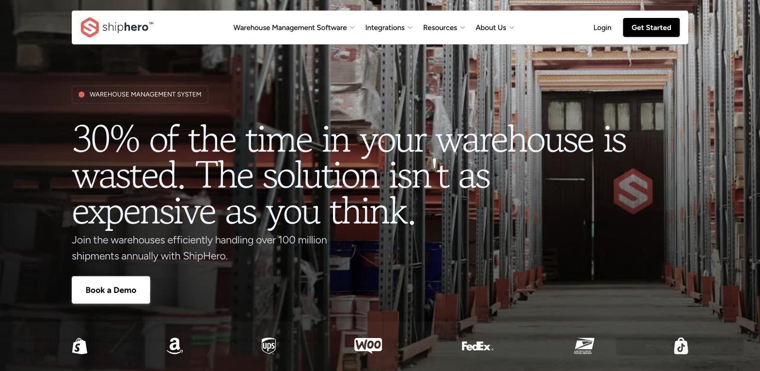
ShipHero's hero opens with: "30% of the time in your warehouse is wasted. The solution isn't as expensive as you think."
That's a three-part punch in two sentences. First, it names the target audience's pain points so specifically that the right buyer immediately recognises themselves in it. Second, it pre-empts the most common objection before the visitor has even scrolled. Third, the implied promise - that there is a solution - creates enough tension to keep reading.
Most SaaS companies use their hero to describe what they do. ShipHero leads with what you're currently losing, which is why pain-led messaging often drives more conversions than generic product descriptions.
The supporting line does another job: "Join the warehouses efficiently handling over 100 million shipments annually with ShipHero." That's social proof via scale, not logos - and it comes before the fold break, right where it's most needed.
When Flowout rebuilt ShipHero's landing page around this pain-first architecture, CVR went from 6.33% to 23%.
The principle: If your ICP already knows they have a problem, name it louder than anyone else does. Pain-led heroes outperform product-led heroes in high-awareness categories every time.
2. Loom - Remove Every Reason Not to Click
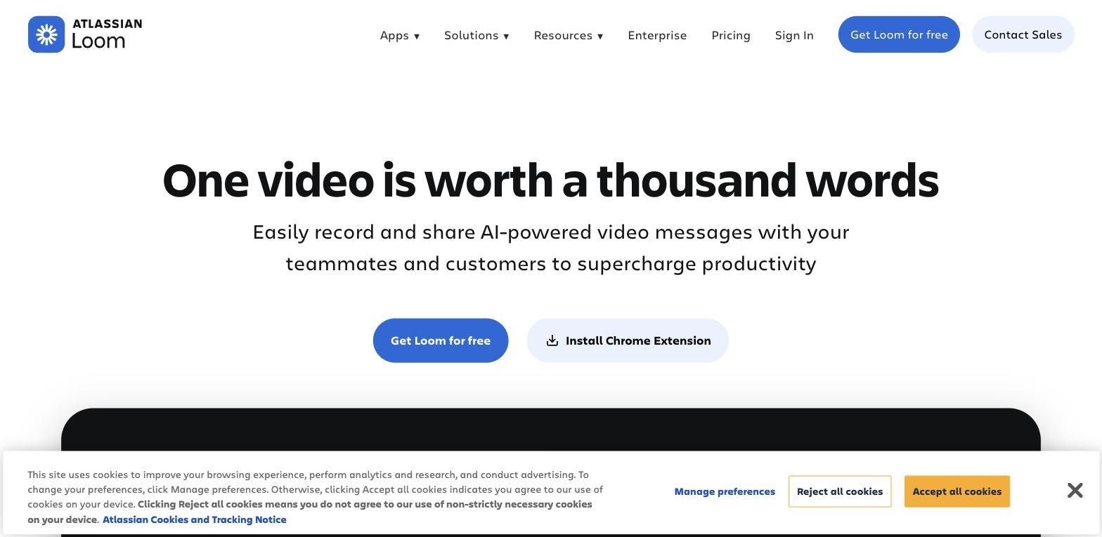
Loom's hero - "One video is worth a thousand words" - is the only one on this list that wins on wordplay. It works because it's instantly understood by anyone who's ever typed a three-paragraph Slack message that could have been a 30-second recording.
The CTA structure is worth studying in detail: "Get Loom for free" paired with "Install Chrome Extension." Two entry points for two different types of ready buyers, with the free product path acting like a natural route into free trials for self-serve visitors. The first is for people who want the full product. The second is for people who just want to start right now, in their browser, with no signup friction. Loom doesn't force both into the same funnel.
What Loom also gets right: the product is inherently visual, so the hero flows directly into an embedded product video. They don't describe the value - they demonstrate it.
The principle: Match CTA friction to buyer readiness. Not every visitor is at the same point in their decision. A secondary CTA for the lower-commitment path often converts more total buyers than a single high-friction primary. multiple ctas only work when one path is clearly primary; otherwise, they dilute focus. For a deeper breakdown of how to apply this in Webflow, see our guide to Webflow landing page design.
3. Linear - When Your Design Is Your Brand Promise
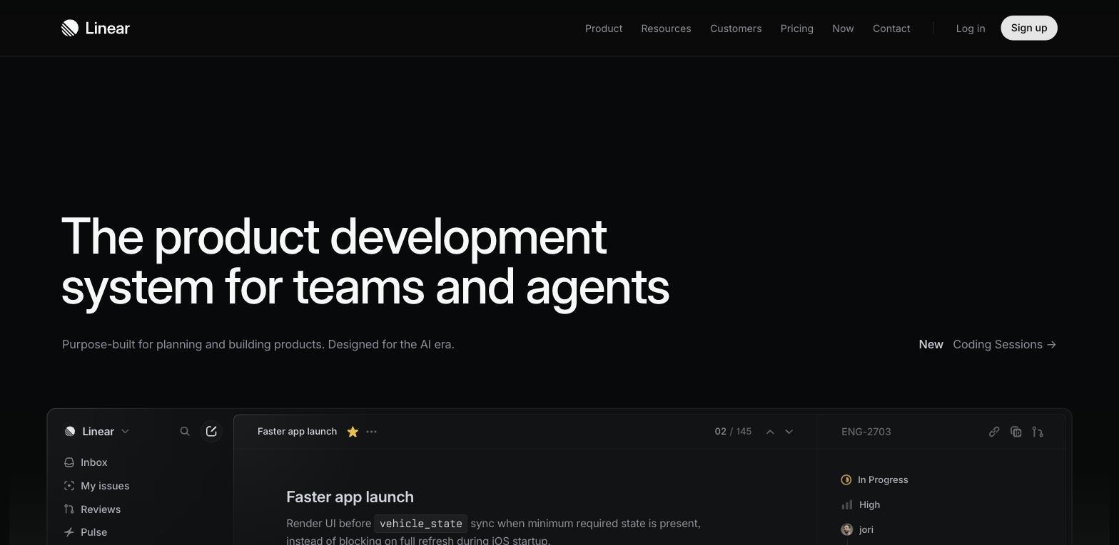
Linear's headline - "The product development system for teams and agents" - won't win copywriting awards. But that's partly the point.
Linear's brand promise is precision, performance, and quality. The page demonstrates that through its design: dark minimal UI, obsessive layout control, zero visual noise, and generous white space that keeps the focus sharp and the layout easy to read. If a product's core claim is that it's beautifully built and lightning-fast, an over-designed homepage would undermine the message. Linear keeps the page as clean and opinionated as the product itself.
The dual audience signal - "for teams and agents" - is doing subtle work. It positions Linear as AI-native without making the whole page about AI. Context, not overclaiming.
And notice what's not on the hero: testimonials, G2 badges, or customer logos. That minimalist approach works in part because there are so few distracting links. Linear's credibility comes from the design itself. The product is the proof.
The principle: The experience of your landing page should feel like a preview of the experience of your product, and the copy should feel professional without sounding overly professional. Disconnect between the two creates distrust before the visitor has seen a single feature.
4. Vercel - Reposition to Own Your ICP
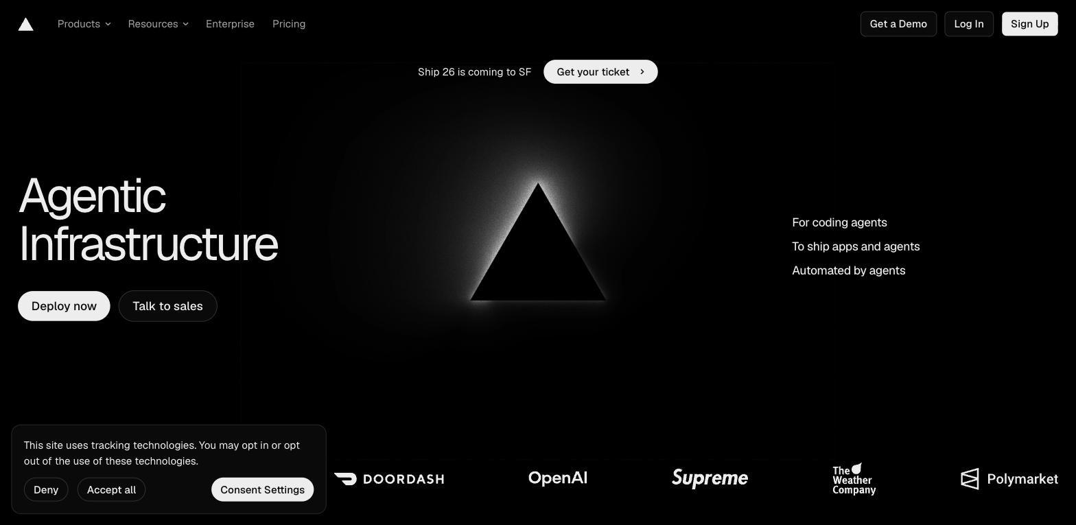
Vercel's current hero says two words: "Agentic Infrastructure."
That's a deliberate repositioning signal to the developer community - this is no longer just a deployment platform for Next.js apps. It's a calculated bet on where infrastructure is heading. The hero doesn't explain "agentic infrastructure" because it's not trying to educate everyone. It's designed to resonate immediately with one specific buyer: engineering leaders building AI-native products.
The recognizable client logos underneath do the credibility work and build credibility for that bold category claim: DoorDash, OpenAI, Supreme, Polymarket. A range of company types and sizes, all using the same infrastructure. Those recognizable names act like a social proof bar under the hero.
This page isn't trying to convert the widest possible audience. It's a filter - attracting the right buyers in and signalling to the wrong ones that this isn't for them. That's a valid conversion strategy when your best customers are worth a lot. If you're an AI company building on Webflow, this kind of category-claiming hero is worth studying closely.
The principle: Repositioning with a bold, unexplained headline works only when your customer logos validate it. Without proof, "Agentic Infrastructure" is just jargon. With those logos underneath, it's a category claim.
5. Rippling - Put Social Proof Above the Hero
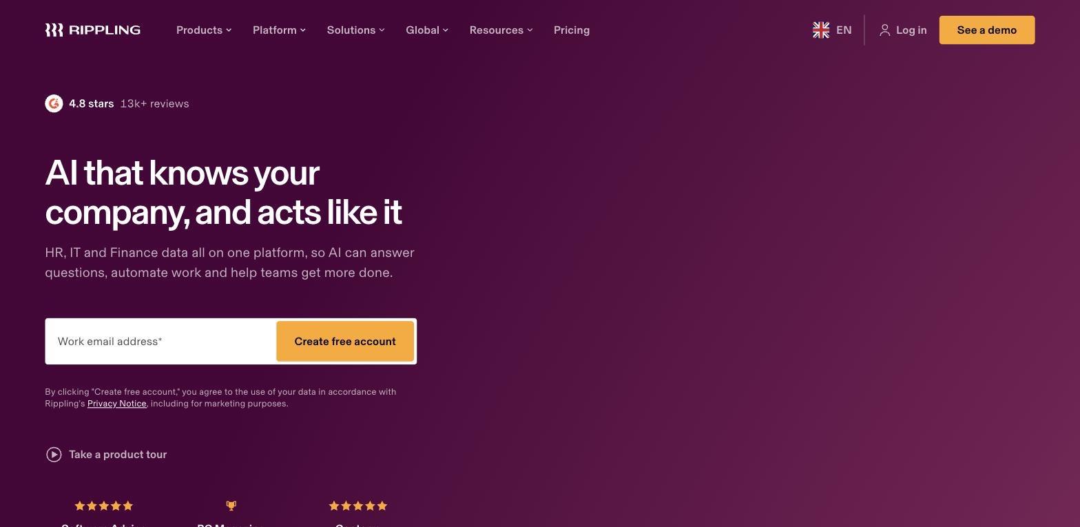
Most landing pages bury their G2 badges in a trust strip below the fold, or next to the CTA as an afterthought. Ripplingputs it first - above the headline, above everything else on the page. Those star ratings act as above-the-fold social proof, and "4.8 stars · 13k+ reviews" is the very first thing you read.
This is a deliberate conversion decision. HR software buyers are notoriously skeptical because they've been burned before. The #1 objection when someone lands on an HR platform isn't "I don't understand what you do" - it's "I don't know if I can trust you." Rippling answers that objection before you've even read the headline, and visible customer feedback and testimonials help answer it immediately.
The hero copy - "AI that knows your company, and acts like it" - is strong positioning in a competitive category. But the really smart conversion work is the inline email-capture form in the CTA. No separate landing page, no modal, no funnel step. The conversion happens right there, and the "work email" qualifier simultaneously screens for business intent.
The principle: The position of your social proof tells buyers when you expect them to have doubt. Move it to where the doubt is highest - in many categories, that's before they've read a single word of your copy, and social proof can increase conversions by 34% on landing pages.
6. Notion - The Dual CTA for Two Types of Buyer
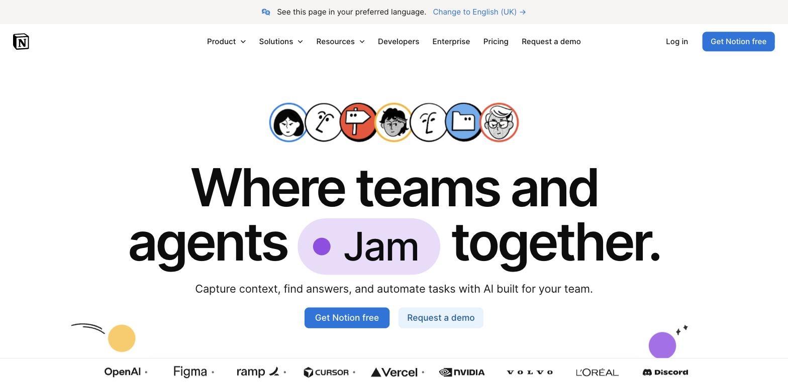
Notion's current hero - "Where teams and agents Jam together" - marks a clear pivot from personal productivity tool to enterprise collaboration platform. The animated label (cycling through product names) signals the breadth of what Notion can do without requiring a feature list.
The conversion architecture is the real lesson here. Two CTAs sit side by side, speaking to each target audience segment across different team sizes and buying motions: "Get Notion free" (primary, blue) and "Request a demo" (secondary, white outline). This is a textbook PLG-to-enterprise strategy compressed onto one hero: self-serve buyers take the free path, enterprise buyers take the demo path. Neither is blocked by the other.
The logo strip below is expertly curated: OpenAI, Figma, Ramp, Cursor, Vercel, NVIDIA, Volvo, L'Oréal. That span - from startup darlings to Fortune 500s - tells every size of company "this works for you," while reflecting the key differences between self-serve and enterprise buyers that the CTA pair accounts for. It takes careful curation to pull off logos at both ends of the market without looking unfocused.
The principle: If your product serves both self-serve and enterprise buyers, your CTAs should acknowledge both paths explicitly. Forcing enterprise buyers through a PLG funnel (or vice versa) creates friction that kills conversion.
7. Stripe - Make Your Numbers the Hero
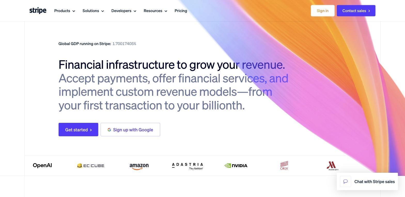
Stripe's homepage does something no testimonial or G2 badge can match: it puts a live, animated counter front and centre. "Global GDP running on Stripe: 1.70017405%" - and the number ticks upward in real time as you watch, which is one reason it belongs among the best landing pages, not just the best saas landing pages.
No static metric conveys scale like a live counter. It doesn't just tell you Stripe is large. It makes you feel it.
The headline that follows - "Financial infrastructure to grow your revenue" - does what most SaaS headlines fail at: it leads with the outcome (grow your revenue) before the mechanism (financial infrastructure). You don't buy financial infrastructure because you want infrastructure. You buy it to grow revenue.
One line in the hero is doing particularly heavy lifting: "from your first transaction to your billionth." That's targeting both the startup founder and the enterprise CFO in a single phrase - a very hard thing to do without sounding generic, and Stripe pulls it off cleanly.
The principle: Live proof of scale beats static social proof when you have it. A real-time counter that shows your product working right now is more persuasive than any number of testimonials, especially on the web where it updates in real time.
8. Jasper - Win a Crowded Market With Specificity
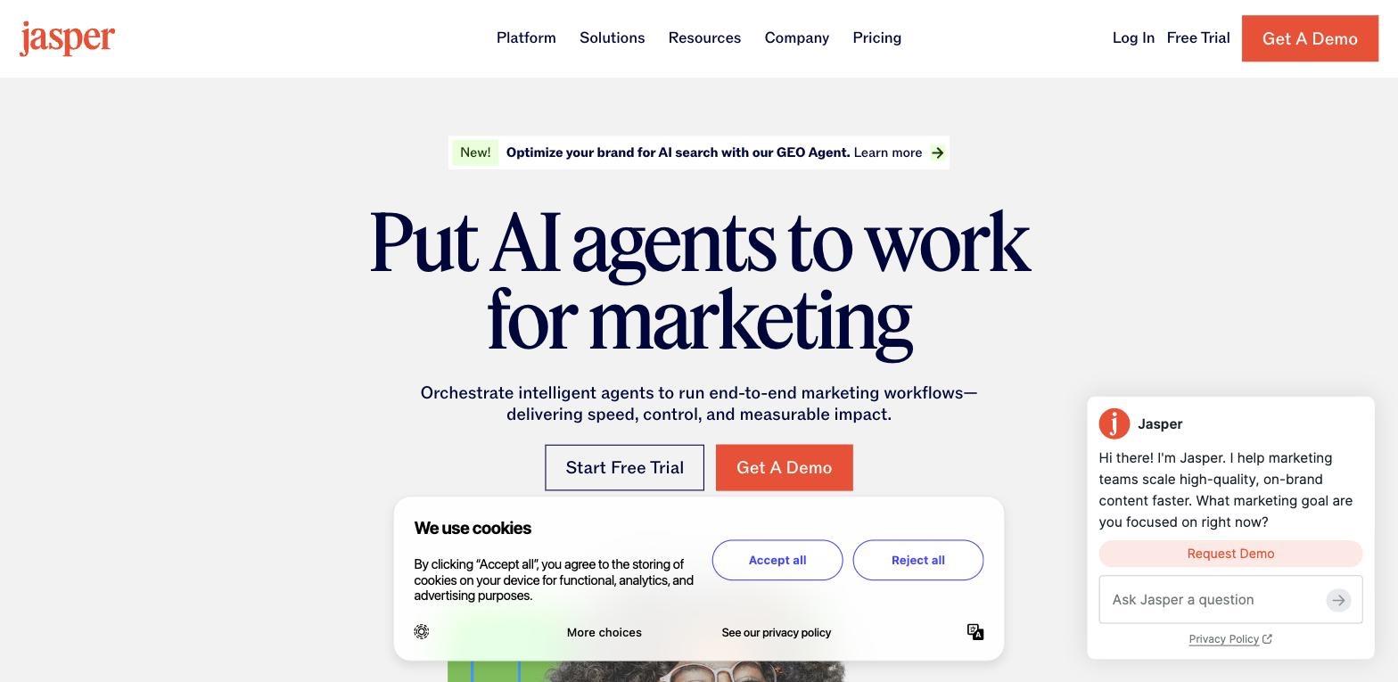
In an AI marketing tools market with hundreds of competitors, one of the strongest real SaaS landing examples stands out because vague positioning ("AI for your marketing team") is indistinguishable noise. Jasper's hero - "Put AI agents to work for marketing" - does two things: it names the AI paradigm shift (agents, not tools) and anchors it firmly to one function (marketing). Not sales, not ops, not everything. Marketing.
The subtext adds the specificity that seals it: "Orchestrate intelligent agents to run end-to-end marketing workflows - delivering speed, control, and measurable impact." Speed, control, and measurable impact map directly to the three objections most marketing leaders have about AI adoption. The messaging becomes feature focused only after the core promise is clear. All three addressed, in eleven words.
Dual CTAs again - "Start Free Trial" and "Get A Demo" - serving two buyer types from the same hero.
When Flowout rebuilt Jasper's site with a focus on conversion architecture, clearer visual hierarchy, and a hero built around transformation rather than features, using screenshots to make that shift more tangible, demo bookings increased by 62%.
The principle: When your category is crowded, specificity is your biggest differentiator. Vague benefits make you easy to substitute. Specific outcomes - tied to a specific function and a specific outcome - make you the obvious choice for the buyer who needs exactly that.
9. Intercom - Defuse the Objection Before It Forms
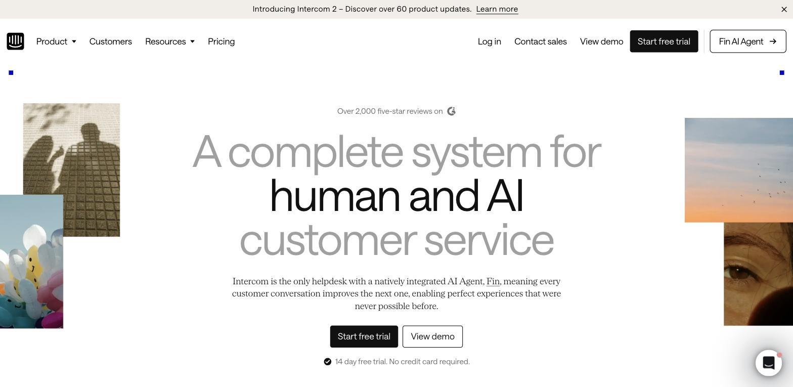
Intercom's hero - "A complete system for human and AI customer service" - is a big claim. "Complete system" suggests complexity, cost, and commitment. They start defusing that immediately: "Over 2,000 five-star reviews on G2" sits above the headline, before the visitor has processed the claim.
The CTA block is the most instructive element on this page. Primary CTA: "Start free trial" (black, high contrast). Secondary: "View demo" (white outline). Together they keep a single goal in focus: getting the visitor into the next step. And directly underneath both, in small quiet text: "14 day free trial. No credit card required."
That last line is doing the heaviest conversion work on the page. The #1 reason buyers don't start a free trial isn't indifference - it's fear of forgotten charges and the friction of cancellation. Placing the reassurance next to the CTA rather than in the footer or a tooltip increases conversion directly, and minimizing friction also means using minimal form fields for higher completion rates. It's not an aesthetic choice; it's conversion engineering.
The announcement bar at the top - "Introducing Intercom 2 - Discover over 60 product updates" - does one more thing: it signals momentum. Existing users considering alternatives see active development. Prospects see a product that ships. Both interpretations help, and pages lose trust when they interrupt that flow with intrusive pop ups.
The principle: Objection pre-emption works best when placed next to the moment of decision. Put your reassurances next to your CTAs, not buried in copy.
The Pattern Behind the Best SaaS Landing Pages
Looking across all nine examples, three things consistently separate high-converting landing pages from the ones that look good in galleries but don't perform.
They're opinionated about who they're for. Linear doesn't try to look approachable to non-developers. Vercel doesn't explain "agentic infrastructure" to people who don't already know what it means. ShipHero leads with a problem that will only resonate with warehouse operations teams. Each page makes a bet on their ICP and designs everything around it - sometimes at the explicit cost of converting people outside that audience. The best examples also follow a clear structure aligned to one audience and one outcome. For more on how this applies when designing a custom SaaS website, we break it down in detail.
They answer objections before the visitor forms them. Intercom's "no credit card required" next to the CTA. Rippling's G2 badge above the headline. Stripe's live GDP counter instead of a static testimonial. ShipHero's "the solution isn't as expensive as you think" in the headline itself. The best pages don't wait for doubt to accumulate - they address it at the exact moment it would occur.
They treat CTAs as architecture, not buttons. The dual-CTA pattern (free vs. demo, deploy vs. sales) appears in six of the nine examples here. That's not coincidence - it's the recognition that SaaS buyers arrive with different levels of readiness, and a single CTA forces everyone into the same funnel regardless of where they actually are in the decision. The median conversion rate for SaaS landing pages is 3.8%, which is exactly why these patterns matter.
Mobile optimization is essential because many B2B visits happen on mobile devices.
How to Apply This to Your Landing Page
Evaluate your landing page against the five questions from the opening.
Does your hero answer "what is this and who is it for" in under 5 seconds? Is your primary CTA matched to where your buyer actually is in the decision cycle? Is social proof placed where doubt is highest? Are you leading with outcomes or features? Is each section doing one visual job?
Most SaaS landing pages fail at one or more of these. Many high-performing saas landing page examples stay within roughly 250 to 725 words, depending on complexity. The gap between a gallery-worthy design and a page that converts is almost always a conversion architecture problem - not a design problem.
At Flowout, this is the work we do: Webflow landing pages for SaaS built around conversion principles, not just aesthetics, and built to create tailored messaging around each traffic source, including Google campaigns. If your page looks right but isn't performing, we'd be glad to take a look.
Frequently Asked Questions
What makes a great SaaS landing page?
The best SaaS landing pages offer design inspiration and share three things readers should study: a hero that answers "what is this and who is it for" within five seconds, social proof placed where doubt is highest rather than buried in the footer, and CTA structure that accounts for different types of buyer readiness; together, these reflect a clear structure, not just attractive design. Design matters, but it's in service of those three things - not the other way around.
What should a SaaS landing page include?
At minimum: a clear value proposition in the hero (outcome-led, not feature-led), with feature focused copy kept below the fold once the core promise is clear, social proof that matches your category's trust needs (logos for enterprise, G2 reviews for SMB, usage stats for developer tools), a friction-matched primary CTA, and a secondary CTA for buyers who aren't ready to commit. Below the fold, objection-handling copy and screenshots are one of the best ways to reduce uncertainty and do most of the conversion work, while transparent pricing and security details can matter on service pages or product-led pages where trust is a core objection.
Free trial vs. demo CTA: which converts better?
It depends on your deal size and sales motion. Self-serve SaaS products with lower ACV almost always see higher conversion from free trial CTAs, especially when the visitor gets immediate access with as little friction as possible. Enterprise products with complex buying committees typically need a demo path. The answer most companies miss: you don't have to choose. Six of the nine pages in this post run both CTAs simultaneously, routing each buyer type to the right path.
How long should a SaaS landing page be?
Long enough to overcome every meaningful objection, short enough not to add friction. For high-awareness categories (buyers already know they have the problem), shorter pages outperform longer ones. For low-awareness categories or high-ACV products, longer pages with more proof and objection-handling tend to convert better. Scroll depth data from tools like Microsoft Clarity will tell you exactly where your visitors drop off.
What's a good SaaS landing page conversion rate?
Industry benchmarks put average SaaS landing page CVR at 2–5%. High-performing pages in competitive categories regularly hit 8–12%. The ShipHero case study in this post (6.33% → 23%) is an outlier - but not by as much as it sounds. The biggest CVR gains almost always come from structural changes (hero messaging, CTA placement, proof positioning) rather than visual redesigns. See our breakdown of the ShipHero project for the full before/after.
Should I put a video on my SaaS landing page?
Only if it demonstrates value in under 90 seconds without requiring sound. Loom's approach - an embedded product demo that plays automatically and shows the product doing the thing - is the right model. What doesn't work: a two-minute founder explainer or an animated brand video that shows off the design but doesn't show the product working. If your video can't answer "what does this do and why does it matter" within 30 seconds, it's adding friction, not removing it.
How do I know if my SaaS landing page has a conversion architecture problem?
Three signals: (1) your page has healthy traffic but low CVR, (2) your highest-intent visitors (from branded search or direct) don't convert at significantly higher rates than cold traffic, and conversion problems often become clearer when you compare behavior by traffic source, or (3) users scroll most of the page but don't click the CTA. If you're seeing any of these, the issue is usually in the hero message, proof placement, or CTA structure - not in the visual design. Our CRO service is built around diagnosing and fixing exactly this. You can see how we approach and price that work on our pricing page, with mobile responsiveness also being essential during diagnosis because user drop-off often differs by device.