




Most SaaS landing page design guides are just galleries. A hundred screenshots of hero sections with no explanation of why any of them actually work.
This isn't that.
This guide covers the principles, anatomy, and decision-making behind SaaS landing pages that convert - based on Flowout's experience designing and building 490+ SaaS and B2B websites. If you're building or redesigning a landing page and want to understand what actually moves the needle, this is the guide.
Why SaaS landing page design is different
Designing a landing page for a SaaS product is harder than most people expect. Unlike an ecommerce product that visitors can see and touch, SaaS products are abstract. You're selling a promise - a future state - which means your design has to do a lot of heavy lifting around trust, clarity, and credibility before the visitor even considers clicking a CTA.
A few things make SaaS specifically tricky:
The product is invisible. You can't show visitors the thing you're selling - only what it does for them. Design has to bridge that gap through product screenshots, demo videos, and outcome-focused copy.
Trust has to be earned fast. SaaS visitors are often evaluating multiple tools simultaneously. You have seconds to signal that you're credible and that your product solves their specific problem.
Sales cycles vary. A $49/month self-serve tool and a $50K/year enterprise platform need very different page architectures. The design has to match the buying journey.
The anatomy of a high-converting SaaS landing page
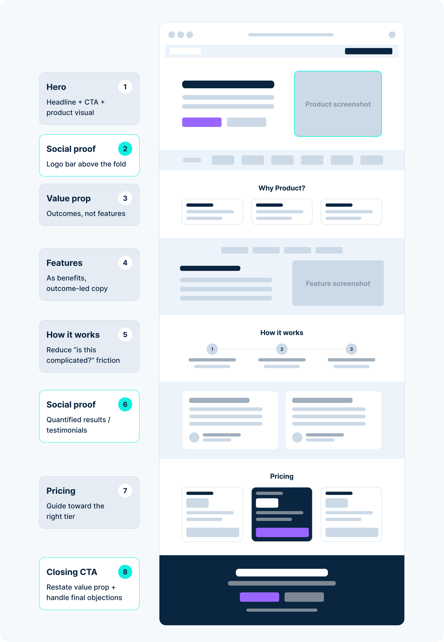
Every high-performing SaaS landing page hits the same structural beats, even if they look different. High-performing pages focus on a single action, so each section should support that goal. Place the primary CTA above the fold, then use a secondary CTA near the end to reduce friction without adding distraction.
Hero section
The hero is where most landing pages are won or lost. Visitors decide within three seconds whether to keep reading, and that’s the critical moment when they determine whether the page is relevant. Your hero needs to answer one question clearly: "Is this for me?"
That means:
- A headline that states the outcome, not the feature
- A subheadline that adds specificity (who it's for, what it replaces, what makes it different)
- A primary CTA that's concrete and low-friction ("Start free trial" or "Sign Up" beats "Get started")
- A visual that shows the product in context - not a stock photo, not an abstract illustration
- Color and contrast should draw attention to the CTA and key message without overwhelming the hero
Bad hero headline: "The all-in-one platform for modern teams" Good hero headline: "Replace five tools with one. [Product] manages your projects, docs, and reporting in a single workspace."
Value proposition section
Just below the hero, before you go deep on features, reinforce the core value proposition. This is often a three-column section with a short benefit statement in each column. Keep it outcome-focused and concrete.
This section also handles the "so what?" objection - visitors who got through your hero but aren't fully convinced yet.
Social proof
Social proof is the most underused element in SaaS landing page design. It tends to work best once visitors already understand the offer. The most effective forms:
- Logo bar with recognizable brands (above the fold if your client list is strong)
- Quantified testimonials with specific outcomes, real feedback, and even video testimonials, which can feel more authentic ("We saw a 3x increase in qualified leads in the first 90 days" beats "Great product!")
- Review platform scores (G2, Capterra, Trustpilot ratings with review counts)
- Case studies embedded inline, not buried in a separate section
Flowout's work with ShipHero resulted in their conversion rate jumping from 6.33% to 23% - that kind of result belongs on the landing page front and center, not in a footnote. Similarly, Jasper saw demo bookings increase 62% after a full landing page redesign. Strong social proof also includes data-driven credibility, such as usage details like "15,000+ teams use this product," because those examples support broader marketing claims. Specificity is what makes social proof work: measurable proof and authentic customer feedback beat vague praise.
Features vs. benefits
SaaS companies consistently make the same mistake: leading with features instead of benefits, instead of keeping simplicity in how benefits are communicated. Features describe what the product does; benefits describe what it does for the user.
"Advanced reporting dashboard" is a feature. "See exactly where deals are stalling - and fix it before the quarter ends" is a benefit.
Your features section should translate product capabilities into user outcomes. A good pattern is to alternate: benefit statement as headline, feature description as supporting copy, with screenshots that make the product’s functionality easy to understand rather than just showing the UI.
How it works
A short, three-to-four step explanation of the product workflow reduces friction for visitors who are interested but unsure what getting started looks like. This section handles the "is this complicated?" objection.
Keep it simple and create easy access to understanding the workflow without overwhelming the visitor. The goal isn't to explain everything - it's to make the product feel accessible and minimal, not exhaustive.
Pricing section (on landing pages)
If you include pricing, structure it around clear pricing tiers so visitors can compare options and move toward the right fit rather than just scanning a list. If the pricing model has important complexity, add a link to more details instead of overloading the main table. Highlight the most popular plan, use feature comparison to differentiate tiers, and make the CTA for each tier distinct.
For enterprise or high-ACV products, a "Contact sales" option needs to feel like a premium path, not a fallback for people who can't figure out the pricing; many saas products also need trust and security reassurance near pricing because that is where buyers often look for it.
Closing CTA section
End the page with a restatement of your core value prop and a CTA that can drive trial starts, demo requests, or other next steps. Visitors who make it to the bottom are interested - don't let the page just end. This section can also handle final objections: "Free 14-day trial. No credit card required. Cancel anytime," or use CTA language that prompts a request for higher-consideration products.
SaaS landing page design principles that drive conversions
Beyond the structural anatomy, these are the design and copywriting principles that consistently move conversion rates.
Lead with outcomes, not features. Every headline, section header, and CTA should be framed around what the user gets, not what the product has.
Match the design to the buyer. A developer tool needs a different visual language than a sales enablement platform. Design should signal "this is made for people like you" at a glance.
Reduce friction at every decision point. Friction is anything that makes a visitor pause, reconsider, or second-guess. Long forms, vague CTAs, slow load times, confusing navigation - all of these reduce conversions. Pages with fewer form fields usually get more completions, so keep asks minimal. The design's job is to remove as much friction as possible between landing and converting, and to implement that clearly across the whole website.
Handle objections inline. Don't wait for the FAQ to address concerns about pricing, security, or switching costs. Weave objection-handling into the page body: a security badge near the signup form, "cancel anytime" next to the trial CTA, a "migrate your data in minutes" callout near the pricing section.
Use visual hierarchy to guide the eye. Visitors scan before they read. Design the page so the key messages - headline, value prop, social proof, CTA - are visible even on a fast scroll. This means thinking about font size, contrast, whitespace, and placement before thinking about color or decoration. Space helps reduce clutter and direct attention, especially on mobile, where roughly 79-83% of visits now happen first. Use animation only when it helps explain a concept or supports understanding. Many teams over-prioritize flashy visuals, but motion alone does not increase conversions.
Don't underestimate page speed. A beautiful landing page that loads in four seconds will underperform a simpler one that loads in one second. Page speed is a conversion factor, not just an SEO factor. Flowout's speed optimization workconsistently shows a direct relationship between load time and bounce rate. In practice, that means compressing images and minimizing heavy scripts wherever possible.
Common SaaS landing page design mistakes
These are the patterns that appear most often in underperforming SaaS landing pages.
Feature-led headlines. The most common and most damaging mistake. If your headline describes a product attribute rather than a user outcome, rewrite it.
Generic CTAs. "Get started" and "Learn more" are low-intent. CTAs that describe the action and the value ("Start your free trial", "See it in action", "Get a free analysis") consistently outperform generic ones.
No social proof above the fold. If you have strong logos, numbers, or G2 ratings, they belong near the top of the page - not at the bottom. Trust signals do more work early in the page than late.
Too much on one page. SaaS landing pages often try to explain every feature and use case. This creates cognitive overload and dilutes the conversion path. A focused page - even if it leaves some things out - almost always converts better than a comprehensive one, because unnecessary elements across the site create clutter and reduce clarity.
Treating design and copy as separate workstreams. Good SaaS landing page design is the integration of design and copy. When copy is written after the page is designed (or vice versa), you end up with headlines that don't fit the visual rhythm, or layouts that don't support the message hierarchy. Prioritize essential elements over decorative extras.
No mobile optimization. B2B buyers increasingly research tools on mobile, even if they convert on desktop. A landing page that's broken on mobile is leaking a meaningful percentage of your traffic, so design mobile-first to keep the CTA visible early and use large tap targets.
What conversion-focused SaaS landing page design actually achieves
The difference between a mediocre SaaS landing page and a well-designed one is measured in pipeline, not pixels.
The median conversion rate for SaaS landing pages is 3.8%, though the ideal performance range varies by product complexity and audience. ShipHero, one of Flowout's clients, saw their conversion rate go from 6.33% to 23% after a full landing page redesign focused on conversion architecture - not just visual polish. Since pages exceeding 10% conversion rates are strong performers, that's not an aesthetic improvement; it's a fundamental shift in how the page communicates value and handles objections.
Jasper, another Flowout client, saw a 62% increase in demo bookings after a redesign that restructured the hero section and improved the CTA path.
These results don't happen because of better colors or a new font. They happen because conversion rate optimization is treated as the primary design constraint, not an afterthought.
How to approach the SaaS landing page design process
The most common mistake in the process is starting with design before establishing positioning.
1. Start with positioning. Before any wireframes or visual work, define: Who is this page for? What problem does it solve? What makes your solution different? Start by evaluateing what the visitor needs to understand before acting, and what they need to believe in order to convert. These answers should drive every design decision.
2. Wireframe before you design. Wireframing establishes information hierarchy, section flow, and CTA placement without the distraction of visual decisions. A template can help as a structural guide, but it should follow the buyer's evaluation flow. A wireframe should be reviewable by your whole team - including people who aren't designers.
3. Design for the CTA path first. Work backwards from the conversion action. What does the visitor need to see, believe, and feel before they're ready to click? Structure the page around that sequence, and create it around that path rather than visuals alone.
4. Design and copy together. If you're working with a team, have the copywriter involved from the wireframe stage. Many teams start by chasing visually impressive layouts instead of clarity. Headlines and supporting copy should be developed in context, not written in a doc and dropped into a Figma file later.
5. QA for conversion, not just appearance. Before launch, check: Does the CTA work on every device? Are forms tested end-to-end? Is the page speed under two seconds? Are trust signals visible above the fold? Is there a clear next step at the bottom of the page? Teams also need to implement those decisions consistently across copy, layout, and QA.
6. Treat launch as the beginning, not the end. The highest-performing SaaS landing pages are iterated over time - through A/B tests, heatmaps, and user research. Launch is when the real optimization data starts coming in.
Frequently asked questions
What should a SaaS landing page include?
A high-converting SaaS landing page should include a benefit-led hero section with a clear CTA, a value proposition section, social proof (logos, testimonials, ratings), a features-as-benefits section, a brief "how it works" explanation, pricing (or a path to pricing), and a closing CTA. The specific sections vary based on product complexity and buyer journey length.
How long should a SaaS landing page be?
It depends on the product and buyer. Self-serve tools with lower price points can convert on shorter pages because the commitment is lower. Enterprise products with longer sales cycles typically need more content to build sufficient trust and handle objections. A good rule: include every section that answers a question your buyer would have, and cut everything else.
What makes a SaaS landing page convert?
Conversion comes from clarity, trust, and reduced friction - in that order. The page needs to clearly communicate what the product does and for whom, give visitors enough confidence to take the next step, and make that next step as easy as possible. Design quality supports all three, but design alone doesn't drive conversions - the underlying positioning and value proposition have to be strong.
Should a SaaS landing page have navigation?
For campaign-specific landing pages (paid ads, email campaigns), removing navigation reduces distraction and typically improves conversion rates. For organic landing pages that serve both acquisition and brand-building purposes, navigation is often appropriate. When in doubt, test both.